
Whether you know it or not, you’ve visited a responsive website in the last week while surfing the wonderful World Wide Web. And even if you don’t know what a responsive website is, you’ve probably heard people throwing around the “responsive” buzzword for some time now. If you need to get up to speed, or want to learn more about why a responsive website might be a good idea for your business, I encourage you to check out Industrial Strength Marketing’s primer, “Don’t Make Me Zoom: 7 Reasons Industrials and B2Bs Need Responsive Websites.” Besides serving as a general introduction to responsive websites for business, it covers the benefits responsive sites provide, such as SEO, onsite conversion increases, and streamlined content management and analytics.

The responsive landing page for “Don’t Make Me Zoom,” virtually envisioned as it would appear on an iPhone 3 or iPhone 4 using the Responsinator website (see below).
As a developer, I’ll be coming at it from a different angle. My job is to make responsive websites, so I’ll be talking through some suggestions and technical tools that can help developers build responsive websites that sing on desktop computers, tablets, and smartphones.
Start with Process
Getting good processes in place before going into development will help the workflow once a website project makes it into the development phase. Wireframing how each layout will stack will help the design team build an effective mockup. In turn, having a mockup or wireframe will give the developer something to reference while they code the site.
Including the developer in the user experience and design conversations will help the entire team understand what’s possible and what’s outside the confines of the chosen framework (see below). This goes both ways: In some cases, the developer may need to make some decisions about how everything will lay out if the submitted designs don’t conform to the standards of the chosen framework. In those instances, it will be helpful to have the designer sit with the developer to give some input.
Select a Framework
The most important tool in any developer’s bag for building responsive websites is a CSS framework. These frameworks were created to help front-end developers gain efficiencies when building websites. Through the years they’ve evolved to reflect changing development needs and practices. Today, many include grid systems that facilitate responsive development, changing the layout of a website to fit the size of the device used to view it.
The first step for implementing a CSS framework is obviously to select a framework to build in. There are way too many to list here, but a few of the more well-known frameworks are Foundation, Skeleton, Gumby and Bootstrap. At Industrial Strength Marketing, we’ve used a number of frameworks in the past but made the decision to stick with Bootstrap as our framework of preference. One of the biggest reasons for choosing Bootstrap is that it’s more than just a CSS framework. It includes a number of additional tools that can help optimize your website for responsive design.
Test with Tools
It’s critical to have some go-to tools to test the responsive nature of the website you’re working on while you’re building it. Most modern browsers support media queries so resizing your browser will, in most cases, give you a pretty good idea of what your site will look like.
Google Chrome Developer Tools
Click on “Show Drawer” to access the Chrome Emulation tab, which allows you to simulate how your responsive website will display on different devices.
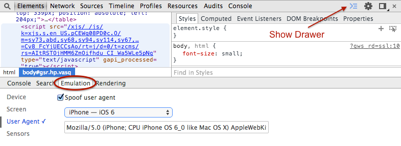
The Emulation tool in the Chrome browser is very helpful and provides support for many popular devices, including iPhone, Nexus 7, Samsung Galaxy, and even BlackBerry Z10. To get to the tools, you right click on a web page and select “Inspect Element.” To get to the Emulation tab, you’ll need to use the “Show Drawer” icon on the right, which looks like an arrow and three lines. Clicking on it will open the tab section at the bottom of the screen and give you the option to select Emulation.
Firefox Developer Tools
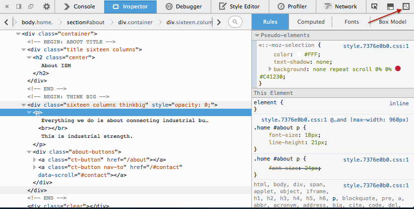
Firefox’s developer tools feature a Responsive Design Mode which can be accessed via the icon at the top right of the “Inspect Element” window.
Much like Chrome, Firefox has its own developer tools. The Responsive Design Mode is a bit different in that you can set some custom sizes (width and height) or use the handles to resize to your desired dimensions. To access the Responsive Design Mode, right click on the web page and select “Inspect Element.” Once in the Inspector, there’s a small icon on the far right in the top bar which switches over to the Responsive Design Mode.
Fitvids.js
Videos embedded from sources such as Vimeo and YouTube generally don’t play well on responsive websites. The Fitvid.js jQuery plugin solves this issue by resizing videos based on the containers they are embedded in so they don’t overflow the viewable area on a device.
Responsinator
Responsinator is an easy-to-use online tool for helping you visualize how your website will appear on various devices. Enter your URL and Responsinator will place your website in “wrappers” that show you what your website will look like on a number of specified devices. This is a user-friendly tool for those who aren’t familiar with developer tools in general.
BugHerd
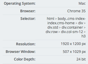
An example of how BugHerd records and displays a user’s browser window size when registering a comment.
BugHerd is a great tool for getting feedback from your team and clients. By putting a snippet of JavaScript from BugHerd on your dev site, you can invite guests to provide comments on the site and record those comments in a log. This is a tool that can be used on all websites, not just responsive sites. However, one of BugHerd’s features makes it incredibly useful for responsive web development: It takes a snapshot of each commentator’s browser information and screen resolution when recording a comment. So if someone had their browser at 480 px wide, BugHerd would register this information alongside the user’s comment so you could factor it into your debugging efforts. Very useful.
Conclusion
Whether you are a seasoned veteran or new to front-end development, you undoubtedly want to avoid the inevitable headaches that come with debugging sites and resolving technical issues. Adopting some of these practices and tools will save you time when working on responsive websites, as well as help you streamline your processes in general.
Having said that, I’m always open to suggestions. I’d love to hear what you’ve got in your developer’s bag and how you’ve managed to create efficiencies. So please leave a comment.