Homepage design is important because your homepage is the front door to your website, the welcome mat, the first impression. Well, not entirely. Not anymore.
In today’s content-heavy, search-laden web, websites are rarely experienced in a linear manner. Users might land on your site through an article link, a social post, or a specific search query; arriving at a page buried deep in your site hierarchy.
Even so, many stakeholders spend most of their time concentrating on the homepage and designers use it as the foundation for the site’s creative direction. In other words, although the nature of user experience has changed, homepage design still plays a vital role in the overall web presence of your business. Given the changing landscape, though, here are some important considerations to take into account, such as new standards for responsive web design and user experience, so that you don’t replicate outdated practices.
Fortunately, there are things you can do to your existing homepage to bring it up to date without creating a completely new website. Here, I’ll outline five things to consider when embarking on a new homepage design before engaging in an entire redesign of your industrial website.
1.The homepage is no longer your most important page.
As mentioned above, there are many paths to your website. Although UX professionals continue to debate whether the homepage is the most valuable piece of real estate on your website, the fact is that browsing and search behaviors have changed dramatically with the use of mobile devices and new avenues for discovering content.
When a 2014 New York Times internal report revealed a massive dropoff in homepage visits, both Quartz and The Atlantic declared the homepage dead.
I disagree with this assessment of the homepage as obsolete. It’s not dead; its role has merely changed. At this point, your homepage mainly serves users who revisit your site, as opposed to new visitors. Which means that it doesn’t need to serve the function of being the first page users will view but can rather be rethought as a utility page for returning visitors. I mean, where do you go when you want to browse the New York Times?
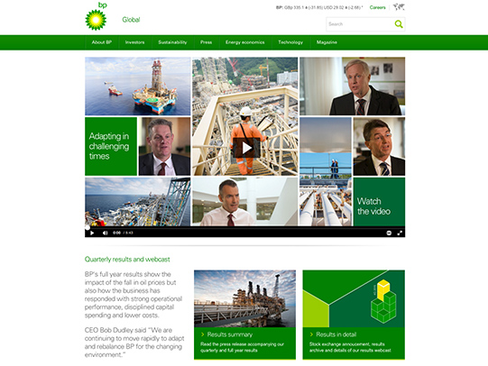
BP’s homepage is built to facilitate deeper engagement with the rest of its site.
2. Everything essential doesn’t need to go “above the fold.”
With the introduction of mobile devices in the past decade and the overwhelming evidence that people browse more on their smartphones than on their desktops/laptops, it goes without saying that the infamous fold has grown increasingly irrelevant.
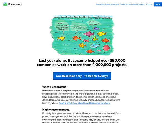
Basecamp’s homepage is built for scrolling, contrary to longstanding assumptions about the importance of “the fold.”
On mobile devices, scrolling has become the inherent gesture for viewing content; it’s practically second nature. Clicking is a conscious choice, and one that users will avoid if possible (just try looking at click-through web galleries on mobile to understand how annoying it is). Scrolling on the other hand, is automatic. Use this to your advantage and don’t be afraid to put some of that important info farther down the page.
3. A homepage design shouldn’t try to capture all your information.
Homepage as navigational hub is the go-to strategy utilized by many. According to this line of thinking, the homepage must support everything — being broad in scope, yet lacking in depth. Using an “everything and the kitchen sink” strategy for homepage design will create a bloated page that suffers from a lack of hierarchy and no clear user flow. Sometimes the best approach is to focus on less to get more out of each site visit.
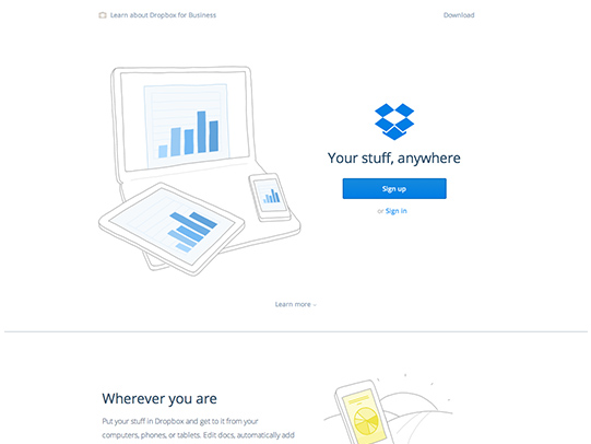
Dropbox takes the idea of embracing simplicity to the extreme with its homepage design.
By embracing simplicity and removing superfluous and distracting content, your homepage will serve your user better as a true navigation hub and inspire a deeper, more engaging experience.
4.The homepage carousel is no longer effective.
On mobile as well as desktop, carousels are becoming less and less effective. Rule of thumb: Don’t do it.
Most users will not click through the slides in your homepage carousel and won’t stick around to view auto-rotating slides. Numerous usability studies show that, test subjects typically click on to another page or scroll past the carousel before a full rotation of the slides has taken place. They simply don’t linger for very long, and certainly not at the top of the page (see point No. 2).
But what if you have multiple messages to convey, you ask. In that case, give close consideration to the hierarchy and importance of the content you want to deliver. And remember that more users are likely to scroll to valuable content located further down the page than click on the next slide at the top.
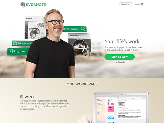
Instead of a home page carousel, Evernote establishes a clear hierarchy of information on its homepage.
5. Homepages should be designed for mobile first; then desktop.
By now you should be noticing an obvious trend — mobile is becoming increasingly more important than desktop and surpasses it completely in many recent case studies.
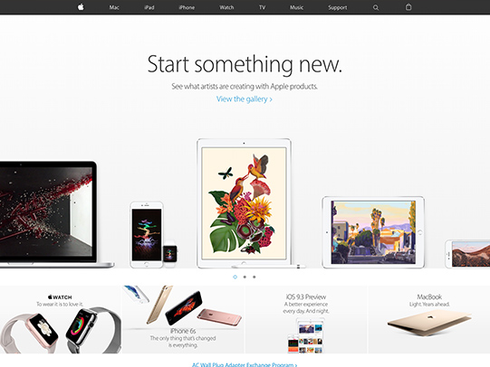
The Apple homepage design caters to mobile users and features mobile devices.
From a design perspective, it’s much easier to expand a mobile homepage design into a desktop model than it is to squeeze a desktop design into a mobile viewport. Also, the need for mobile consideration really forces your content team and stakeholders to determine what information is most pertinent to your audience and what is excessive and unnecessary.
Content is the number one reason why people browse the Internet, but most web projects do not effectively consider their content strategy. The prioritization and structure of the content on your homepage should be primary concerns.
What You Should Focus on for Your Homepage Design
First off, headlines are critical. You have about three seconds to tell a visitor what you have to offer, so keep it short, sweet, and concise. A common pain point for your audience can be a good enticement for further exploration.
Calls-to-action that compel users to dig deeper are essential to good homepage design as well as supporting imagery that helps tell your story. People are visual, so good imagery and easy-to-find buttons will help your users on their journey.
Simple, consistent navigation that is not hidden is an absolute must-have for a well-performing homepage. It provides users a clear path to other pages of the site. A search field is also beneficial in this respect.
To summarize, a well thought-out homepage design must be simple, concise, and provide its audience with clear indicators for navigating to other pages or categories that will address their specific needs. By keeping you homepage design clean and focused, you will not only support your audience, but will establish consistent rules for the overall structure of your website, making a site that is simple to manage and that leaves a lasting impression.